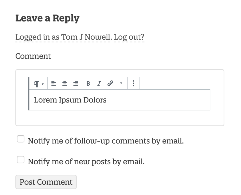
You might have noticed my comment section looks a little.. blocky..
After my WordCamp Europe talk in Berlin about the block list module, I decided to polish up my examples some more and deploy to production.

And so I present, block comments, a prototype of block editor powered comments. https://github.com/tomjn/block-comments
FAQ
How Does it Work?
It uses the <BlockList> component from Gutenberg to list blocks, with some wrapper components. This is then packaged up into a React component and wrapped in a friendly helper function, allowing me to replace any HTML input, with a basic block editor
Are There Any Issues?
Yes and no, use the latest version of the Gutenberg plugin for best results. Otherwise keep a close eye on clashes between editor UI CSS and theme CSS. If you need to add any styling to the editor to fix things, report it in the Gutenberg GitHub issues so that it’s fixed for everybody.
I Installed it On My Website And Now Everybody’s Dead
This isn’t on the wordpress.org plugins section yet as it’s more beta than GM/RC/finished. Take it as inspiration to learn and apply the lessons elsewhere.
How Do Images Work? What About Other Blocks?
If you scroll down and try out an image block, you’ll notice uploading isn’t an option, but using a URL is. I’ve included a whitelist of core blocks, but keep in mind that the plugin doesn’t change how WP processes comments, you are still restricted to the markup allowed in comments. So if you added a new block to the whitelist that used script tags, they’d be stripped out by WordPress on submission
What License is This Under?
I’ve chosen the GPL v2, the same as WordPress and the Gutenberg project.
Feel free to test out the comments below
Hi Tom, I thought I would try this plugin out after reading about it on WP Tavern.
I’ve added a Classic block but couldn’t add content to it.
My embeds didn’t work either. 🙁
I added an image, but it can’t have alt text
Thank goodness I couldn’t add a Columns block!
You might end up with more comment moderation this way…
Thanks for testing! How did you add a classic block btw?
This is my great, great comment!
Hi Tom, I think this is a good idea, and I know this is just an exploration of how blocks can power every interface, but I think it is an overkill for comments. Unless it can be simplified? For instance, instead of having the categories for all the blocks (Common blocks, formatting, layout elements, etc), can you do away with them, and show only a few selected blocks all together, and maybe even showing all of them horizontally rather than vertically? Say, not more than 5 to 10 pre-selected blocks: heading, paragraph, image, youtube embed, etc, and all of them showing without having to scroll down (at least for desktop, not mobile). Then adding comments with blocks would make more sense
wp.tv logo
https://www.youtube.com/watch?v=Y3y74POsDvc
Adding an image and embedding youtube videos seems to not be working
I actually already do limit them to a subset
I love this, and really want to use it in a front end form builder scenario. How could I accomplish this?
The same way you would achieve any other form builder, as long as the result is the input containing the data you want, there’s nothing special. You would need to construct new blocks to represent form fields though